1
2
3
4
5
6
7
8
9
10
11
12
13
14
15
16
17
18
19
20
21
22
23
24
25
26
27
28
29
30
31
32
33
34
35
36
37
38
39
40
41
42
43
44
45
46
47
48
49
50
51
52
53
54
55
56
57
58
59
60
61
62
63
64
65
66
67
68
69
70
71
72
73
74
75
76
77
78
79
80
81
82
83
84
85
86
87
88
89
90
91
92
93
94
95
96
97
98
99
100
101
102
103
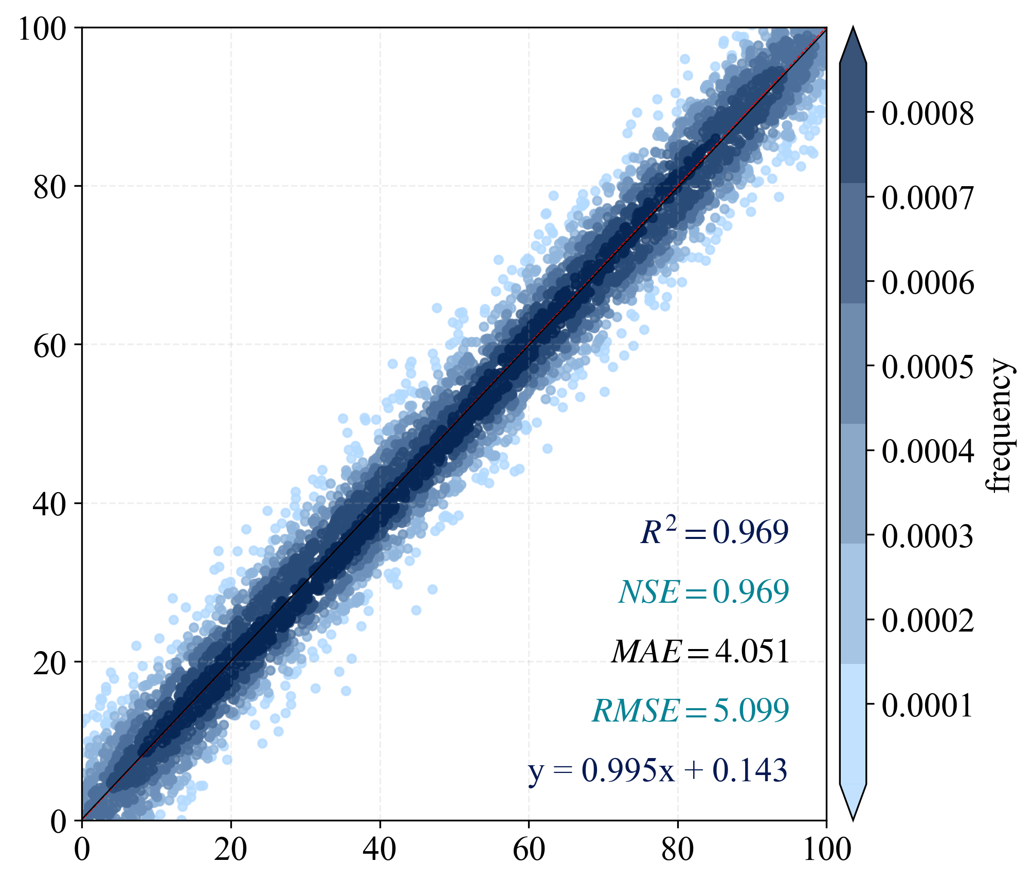
| import numpy as np
import matplotlib.pyplot as plt
from scipy import stats
from matplotlib import rcParams
from statistics import mean
from sklearn.metrics import explained_variance_score, r2_score, mean_squared_error, mean_absolute_error
from scipy.stats import pearsonr
from matplotlib.colors import LinearSegmentedColormap
import os
output_dir = "./output"
os.makedirs(output_dir, exist_ok=True)
n_points = 5000
np.random.seed(42)
x = np.random.rand(n_points) * 100
y = x + np.random.normal(0, 5, size=n_points)
color_type = "frequency"
config = {"font.family": 'Times New Roman', "font.size": 16, "mathtext.fontset": 'stix'}
rcParams.update(config)
def nash_sutcliffe_efficiency(observed, predicted):
observed_mean = np.mean(observed)
numerator = np.sum((observed - predicted) ** 2)
denominator = np.sum((observed - observed_mean) ** 2)
nse = 1 - (numerator / denominator)
return nse
BIAS = mean(x - y)
MSE = mean_squared_error(x, y)
RMSE = np.sqrt(MSE)
R2 = r2_score(x, y)
PCC = pearsonr(x, y).statistic
adjR2 = 1 - ((1 - R2) * (len(x) - 1)) / (len(x) - 2 - 1)
MAE = mean_absolute_error(x, y)
EV = explained_variance_score(x, y)
NSE = 1 - (RMSE ** 2 / np.var(x))
nse = nash_sutcliffe_efficiency(x, y)
print(f"R2: {R2:.3f}, NSE: {NSE:.3f}, MAE: {MAE:.3f}, RMSE: {RMSE:.3f}, nse: {nse:.3f}, PCC: {PCC:.3f}")
if color_type == "error":
z = np.abs(x - y)
else:
xy = np.vstack([x, y])
z = stats.gaussian_kde(xy)(xy)
idx = z.argsort()
x, y, z = x[idx], y[idx], z[idx]
k, b = np.polyfit(x, y, 1)
regression_line = k * x + b
scale = np.ceil(np.max(x)).astype(int)
fig, ax = plt.subplots(figsize=(7, 6), dpi=300)
colors = ['#b3daff', '#062756']
cmap = LinearSegmentedColormap.from_list('custom_blues', colors, N=6)
scatter = ax.scatter(x, y, c=z, cmap=cmap, s=15, alpha=0.8)
cbar = plt.colorbar(scatter, shrink=1, orientation='vertical', extend='both',
pad=0.015, aspect=30, label='error' if color_type=="error" else 'frequency')
ax.plot([0, scale], [0, scale], 'red', lw=0.5, linestyle='--', label='1:1 line')
ax.plot(x, regression_line, 'black', lw=0.5, label='Regression Line')
ax.grid(True, linestyle='--', alpha=0.2)
plt.text(scale * 0.95, scale * 0.35, f'$R^2={R2:.3f}$', ha='right', color='#071952')
plt.text(scale * 0.95, scale * 0.275, f'$NSE={NSE:.3f}$', ha='right', color='#088395')
plt.text(scale * 0.95, scale * 0.2, f'$MAE={MAE:.3f}$', ha='right')
plt.text(scale * 0.95, scale * 0.125, f'$RMSE={RMSE:.3f}$', ha='right', color='#088395')
plt.text(scale * 0.95, scale * 0.05, f'y = {k:.3f}x + {b:.3f}', ha='right', color='#071952')
plt.axis([0, scale, 0, scale])
plt.tight_layout()
save_path = os.path.join(output_dir, "scatter_plot_example.png")
plt.savefig(save_path, dpi=300, bbox_inches='tight')
plt.close()
print("Scatter plot saved to:", save_path)
|